Wednesday, 29 February 2012

Page Layouts

Riba - Presidents Medal Students Awards 

Human Nature - Marie Kojzar


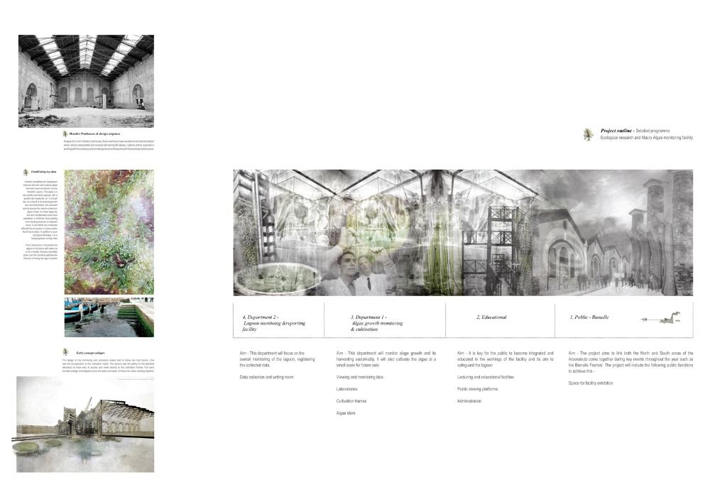
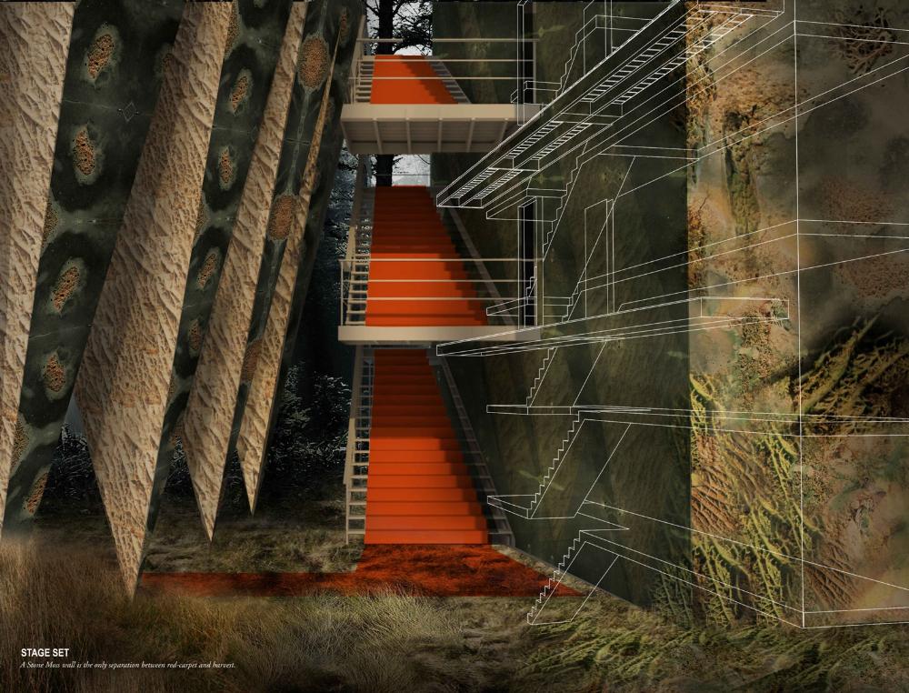
Like the mixture of media showing the new architecture that will be being proposed to the new area.


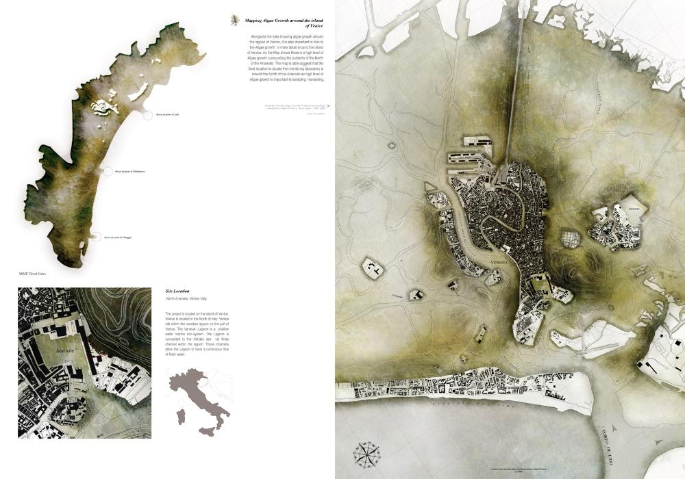
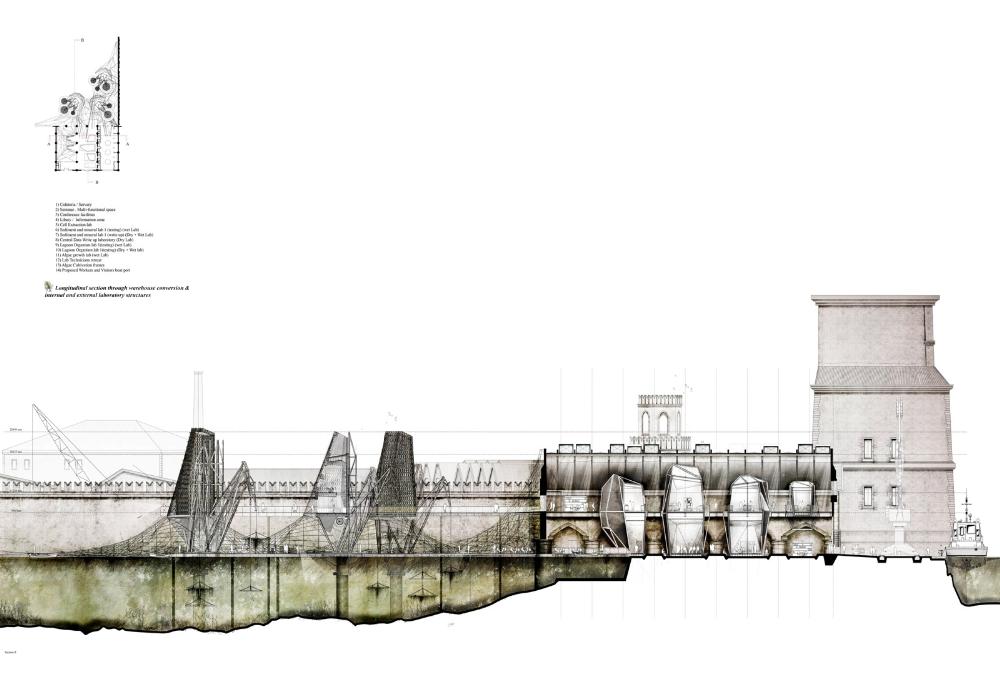
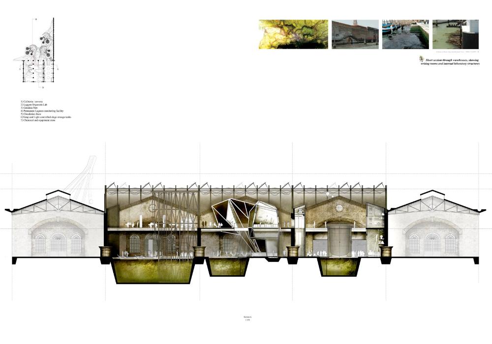
Ecological Research & Macro Algae Monitoring Facility, North Arsenale, Venice

The layout of this piece of work is appealing with the mass use of white space to draw your attention to the images. I like how the colours of the images are muted making the pages look really sophisticated.


The set out for the location of the site is interesting, i like the use of colours and how the site image is broken down.


The sections are very interesting, the use of colour highlight the areas of importance to show the design elements and how the piece will work within the current building.


Zeitgeist Archive, Berlin 


I like how they have used some of the pages to provide images of full renders giving a clear indication of the design proposal.

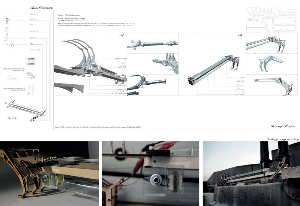
An Acoustic Lyrical Mechanism


The break down of the model with the detailed component drawings help to communicate ideas effectively.


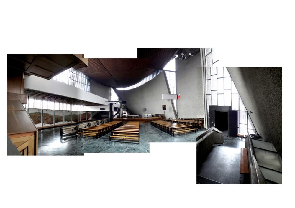
I like the page with it's simplicity of breaking down the image in a fun way, it provides the viewer with an alternative perspective of how the building works together  as well as drawing your attention to certain features within the building.
Thursday, 23 February 2012

Northern Lights Inspiration

The northern lights was my main inspiration due to the shapes that are created and the colours.


Monday, 20 February 2012

Zaha Hadid Opera house

Use of lines and modular shapes great for inspiration, very clean with the use of white.


Interiors create a sense of a much larger space in which the visitor can be amused by.


Colourful interiors

Lighting has created the bright use of colour to the interiors which could be altered depending on the mood that you want to portray within the room.


Splash of colour

Use of light to create the very bold colours within the water


Could create something similar however with words cut into it from certain plays etc


Look at nature and how they bring colour to the environment and inspiration can be drawn from them.


Hotel Reception Miami

Use of lines to help make the space look elongated, good source of inspiration for the community theatre foyer to create more drama. More dramatic colours could be used though, but the design helps to draw your focus to the reception area.


Inspirational ideas

Like the use of simple lighting to held separate the wall design creates focus points around the room making it more interesting. Mixture of textures and bold colours against the wood veneer helping to create a more colourful interior.


Sunday, 19 February 2012

Creative Ideas

Use of well known children's toy to create an intriguing piece of art


Use of colours in such a fun way could be useful for designing areas within the community theatre that give the users a feeling of creativity.


Wave of colour, positive image use of black to help colour stand out


Dramatic use of colour, bold strokes, emotive.


Ice Canyon, contrast in colours